
In Shourly, we offer a robust and flexible platform for creating effective marketing pages. Through its admin panel, you can build a fully customized page using a variety of components. In this article, we explain how to make the most of these tools to create an impactful marketing page.
Access to the admin panel
To get started, log in to the Shourly admin panel. From there, you will have access to a list of components on the left side of the screen. These components will allow you to design your marketing page in a visual and fully customizable way.
Main Components (Heroes)
Shourly offers you three main components to start building your page. It’s important to note that you can only choose one of these three main components, as the system allows you to select only one for the initial structure of the page.
Main Component Options
Componente por defecto
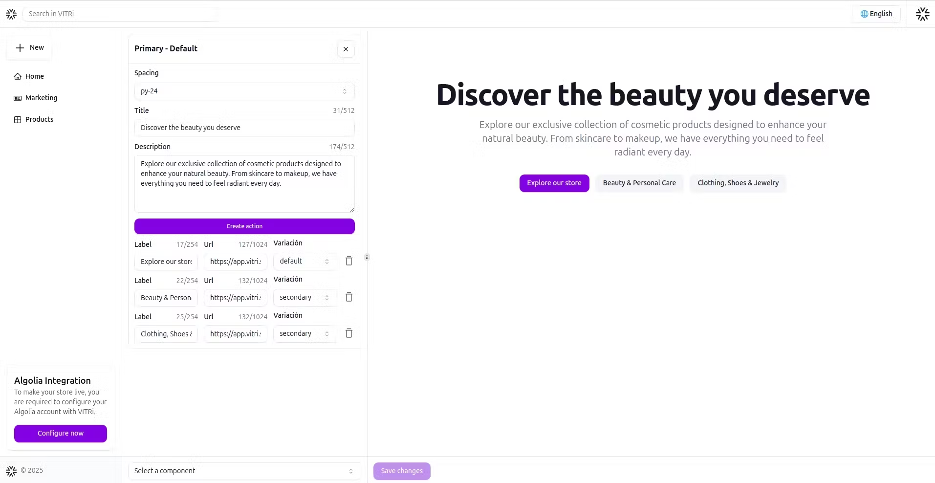
A basic component that includes a title, a description, and a customizable action button. You can adjust the top spacing and choose from several button styles.
Visual image with a header


This component includes an image that you can place on the right or left of a title and description. It also includes a customizable action button and the option to adjust the top spacing.
Visual video with a header
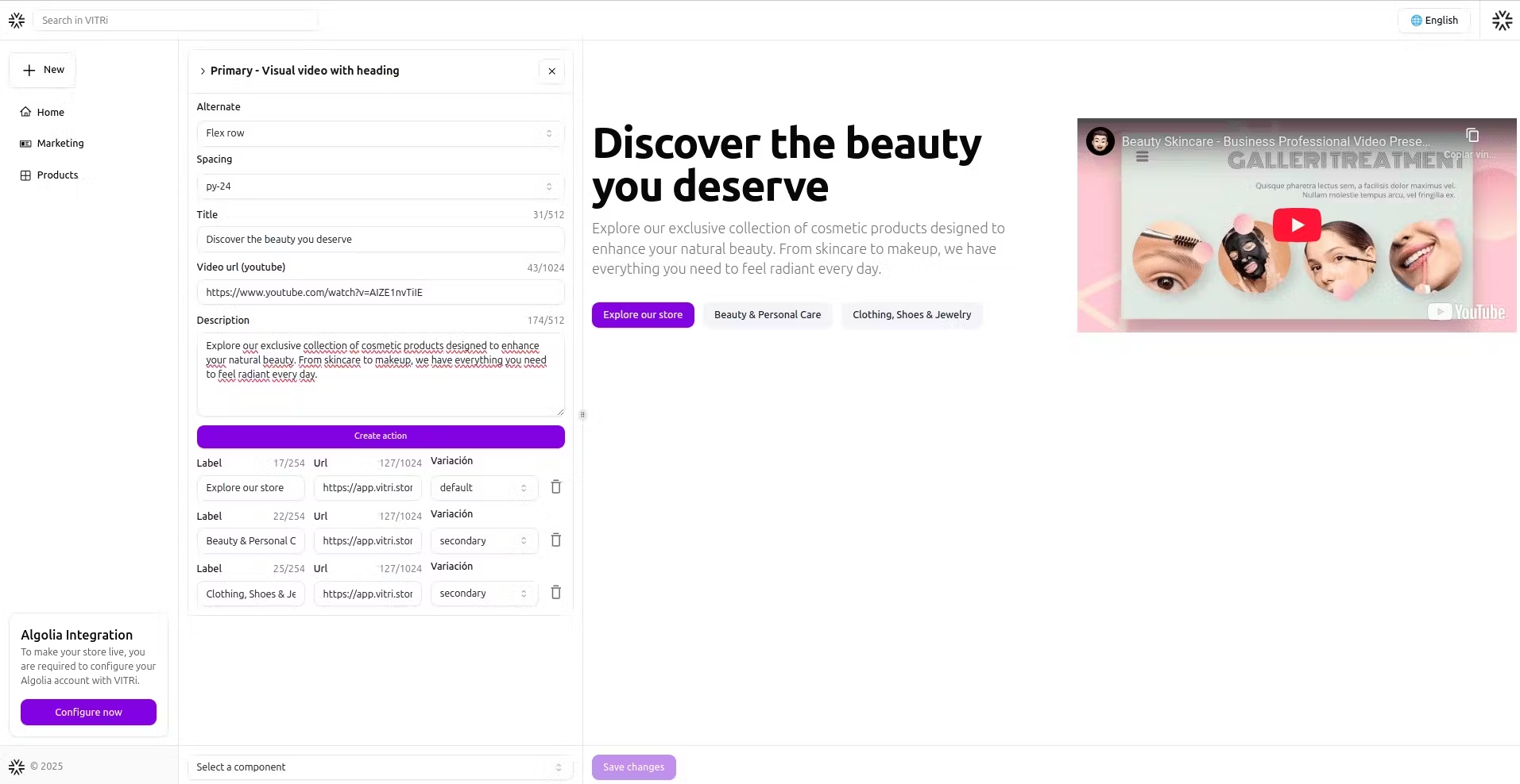
Instead of an image, you can use a video, which you can place on the right or left of a title and description. This component also includes a customizable action button and options to adjust the spacing.
You can only choose one of these three components. Select the one that best represents your initial message and serves as the foundation for the structure of your marketing page.
Secondary components
Unlike the main components, secondary components can be freely combined. While it's not mandatory, the recommendation is to use all of these components to build a complete marketing page. This will provide a richer and smoother experience for users.
Types of available secondary components
Features:
Default

It includes a title, a description, and a button that allows you to create borderless labels. Each label can have its own title and description.
Card list
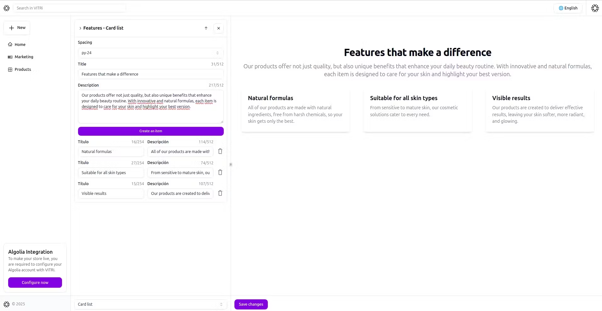
Create a list of cards with a shadowed border, each containing a title and a brief description.
Alternate image list
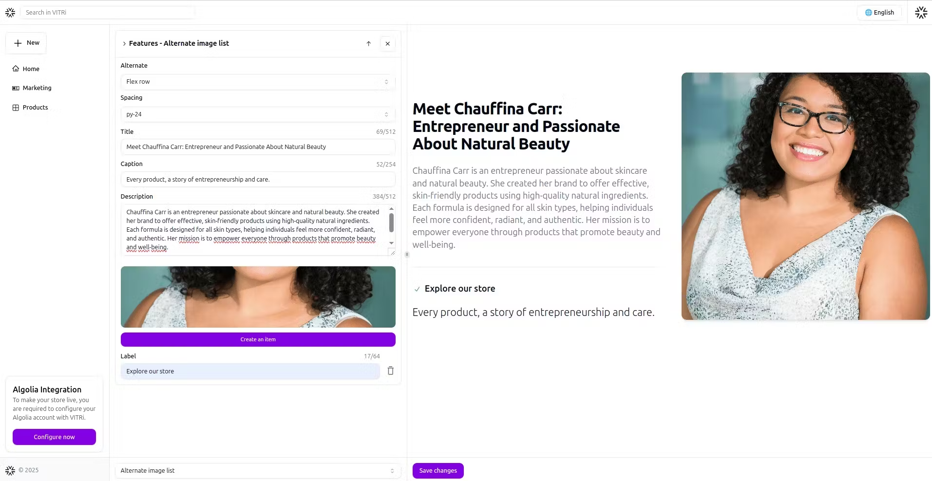

Allows alternating images with text. You can choose the position of the images (left or right) and add a title, caption, and description.
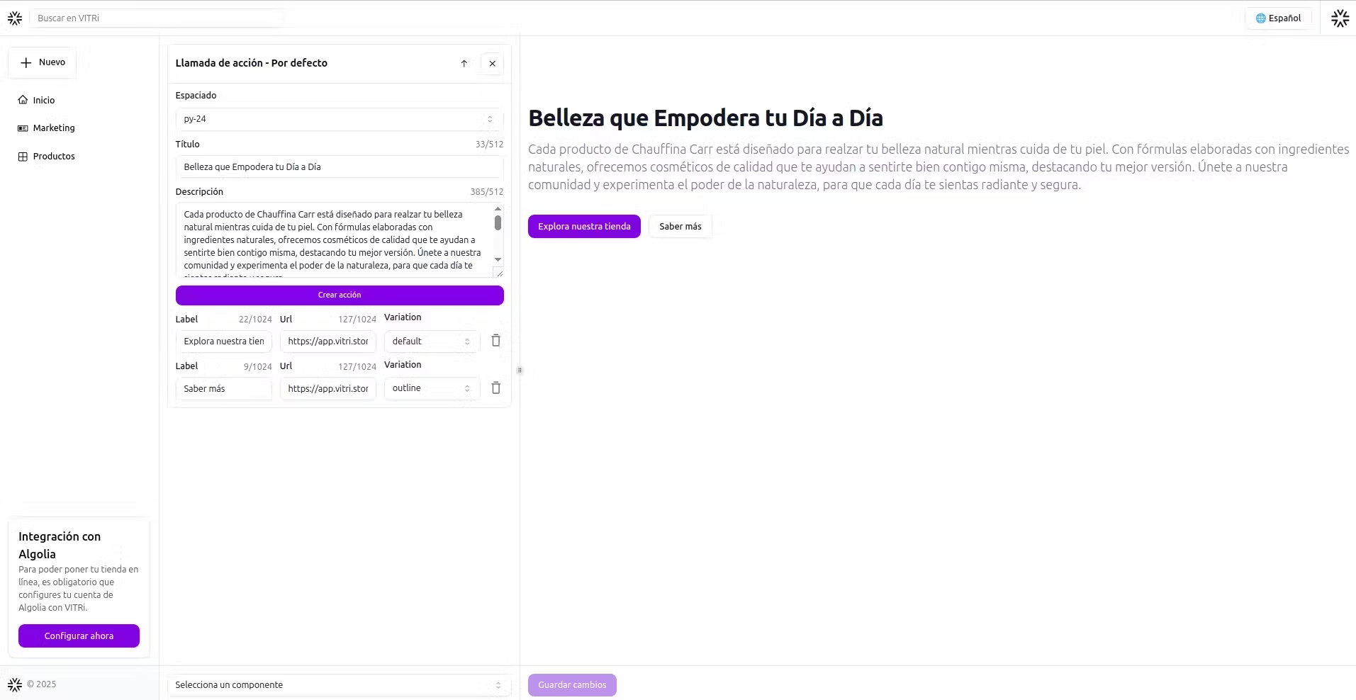
Call to Action (CTA):
Default
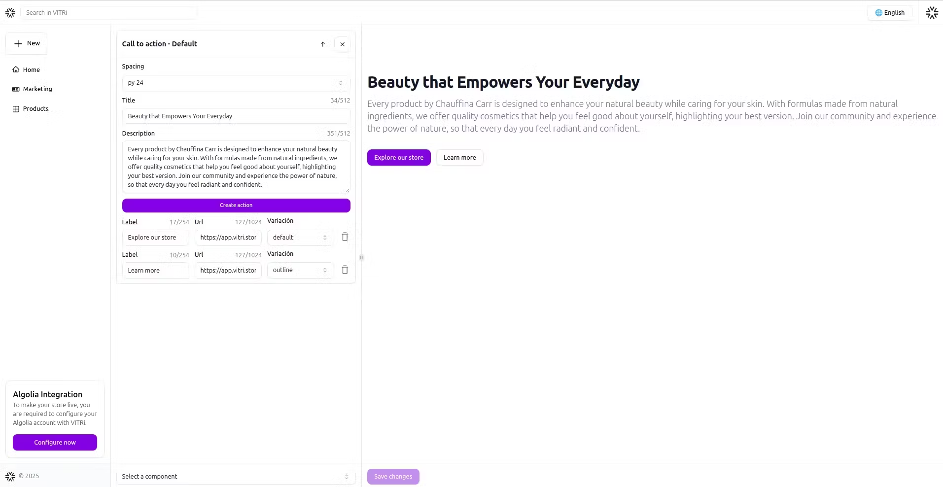
Allows you to add a title, a description, and several action buttons arranged from left to right. You can add buttons with different URLs to encourage the user to take various actions.
Content: Header with description
Includes a title, caption, and description in a gray tone. Ideal for dividing sections or providing additional context.
Images with a header and description
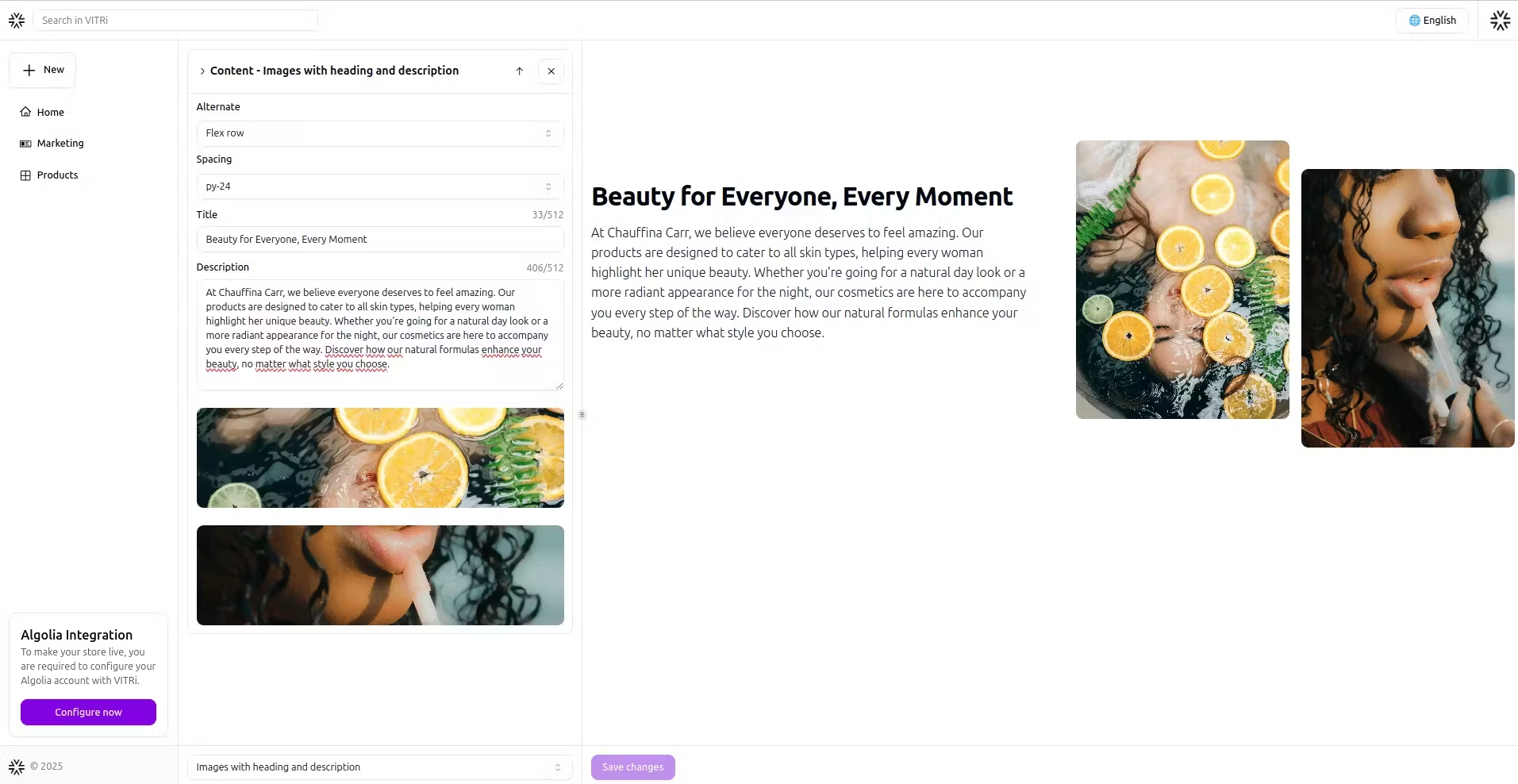
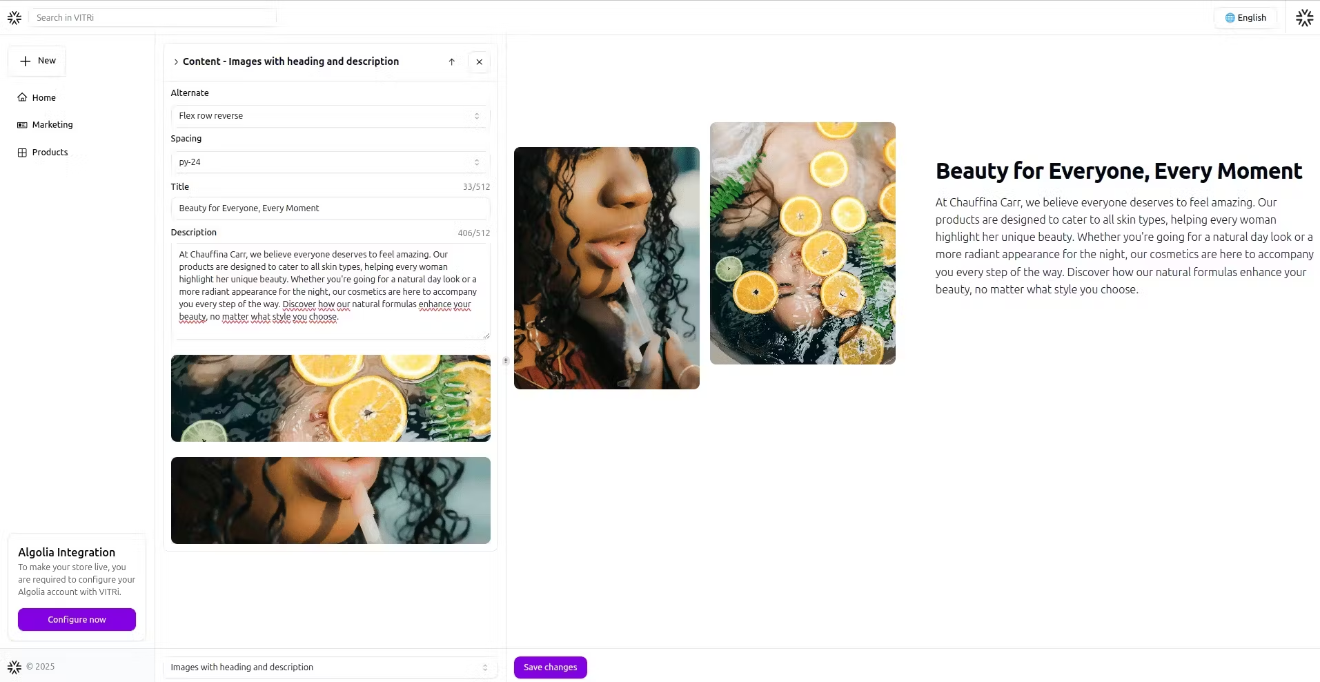
It allows you to add two images, with the option to alternate their position (left or right). Additionally, you can include a title and description for each image.
Embedded video content
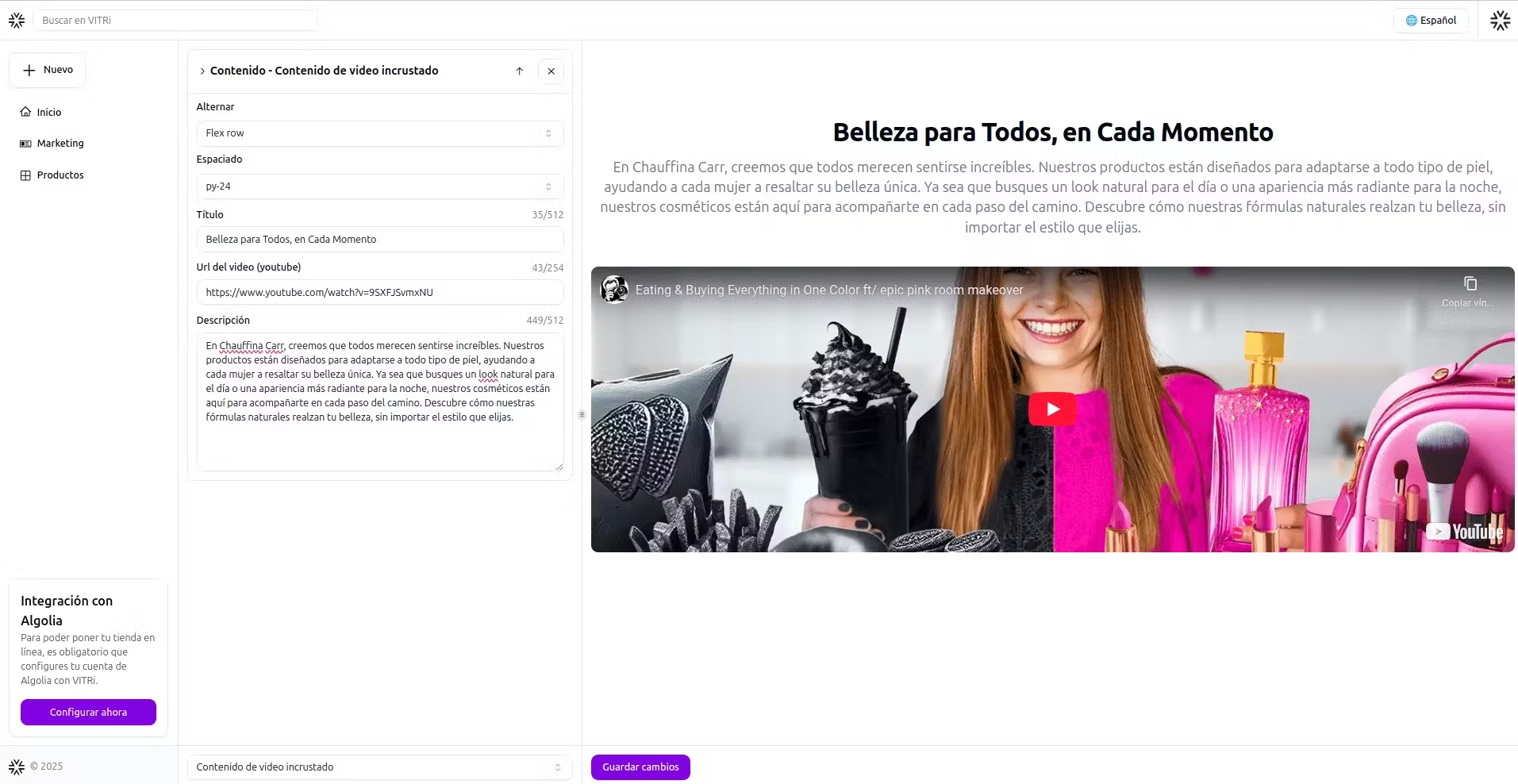

Allows you to embed a video from its URL, add a title and description, and choose the video's position.
Take advantage of the available customization options to adjust margins, element layout, and button styles.
View Demo
Join our community and take your online store to the next level!
Get the latest news, updates, and exclusive tips to optimize your catalog. Don't miss out!